This year through June was painful for equity investors. Global stocks were down nearly 19%, the worst first half of a year in over fifty years. Having gone down so much, is it time for equity prices to start recovering? Unfortunately, it looks like investors are likely to face more pain ahead before the bottom price of this cycle is reached. If a US recession is on the horizon (and that appears increasingly likely), then the odds are that the low of the stock market will occur while the recession is underway, not before.
The Stock Market Low Usually Happens During or After the Recession, Not Before
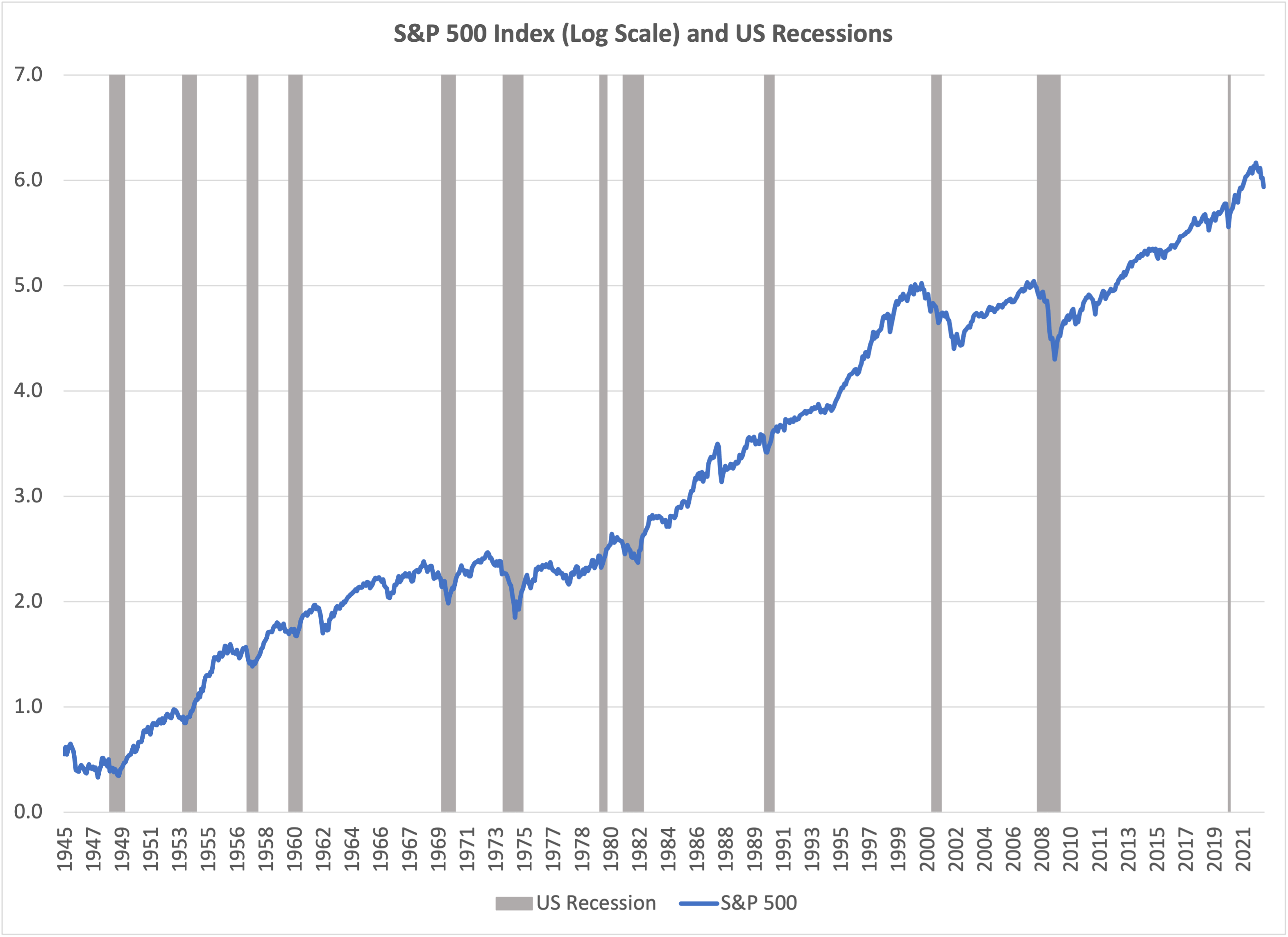
There have been twelve US recessions since World War II, the shaded periods in the chart above.[1] The blue line shows the S&P 500 index of US stocks (log scale). For eleven of these twelve recessions, the low point for the stock index occurred while the recession was underway. The exception to the rule is the 2001 recession – stocks continued to decline after the recession was over. There are no cases over this period where the stock market trough was reached before the recession occurred. But that’s exactly what investors hope for today!
A US Recession is Increasingly Likely
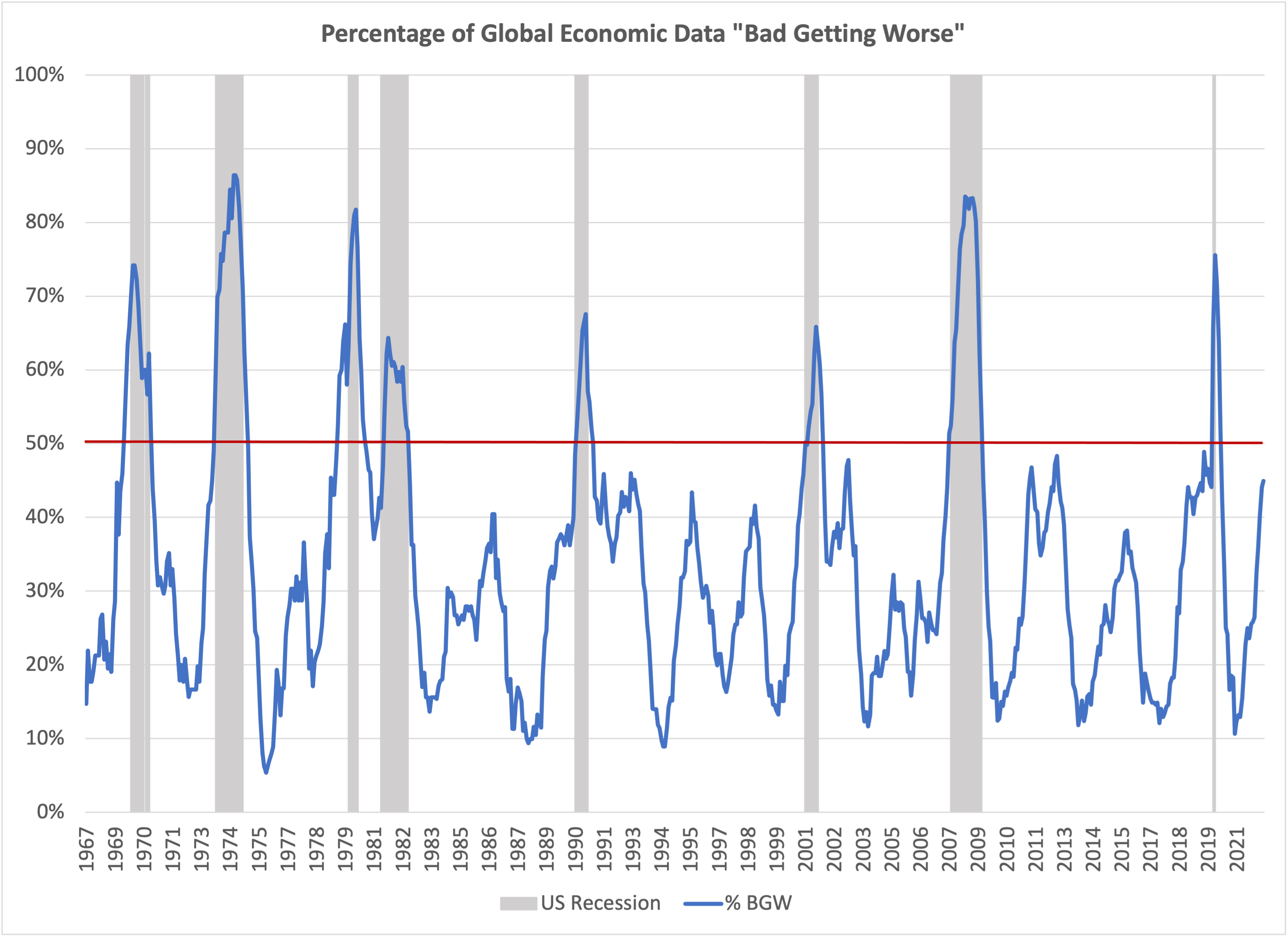
The metric which is most helpful for predicting US recessions is the proportion of global economic data which is “bad and getting worse”. A data series is “bad” if the current reading is below the median for the entire history of that metric. “Getting worse” means the latest data release is worse than the median for the prior year. As an example, the most recent University of Michigan Consumer Sentiment index reading is 50[2]. This index is currently in the “bad getting worse” category because 50 is lower than both the long-term median of 89.3 and the prior year average of 66.4. In fact, 50 is the worst reading in history!
In the last fifty years, whenever the proportion of data in the “bad getting worse” category rose over 50%, the US entered a recession, usually within a few months. Consequently, if we observe that this metric is climbing toward 50% (blue line rising toward the horizontal red line in the chart), particularly if several other items on our equity risk dashboard are negative, we will tend to lower the equity risk in client portfolios. As of June 2022, 45% of the economic indices we track are in the “bad getting worse” category. At the current pace of economic deterioration, the US would reach a recession before the end of 2022. Sometimes levels as high as 45% have been reached and the US economy turned for the better, without reaching a recession. But it’s hard to think of a likely source for a turnaround in the economic trend this year, particularly given that aggressive global monetary tightening is underway.
No More Disconnect! The Decline in Stock Prices Aligns with the Decline in Economic Indicators
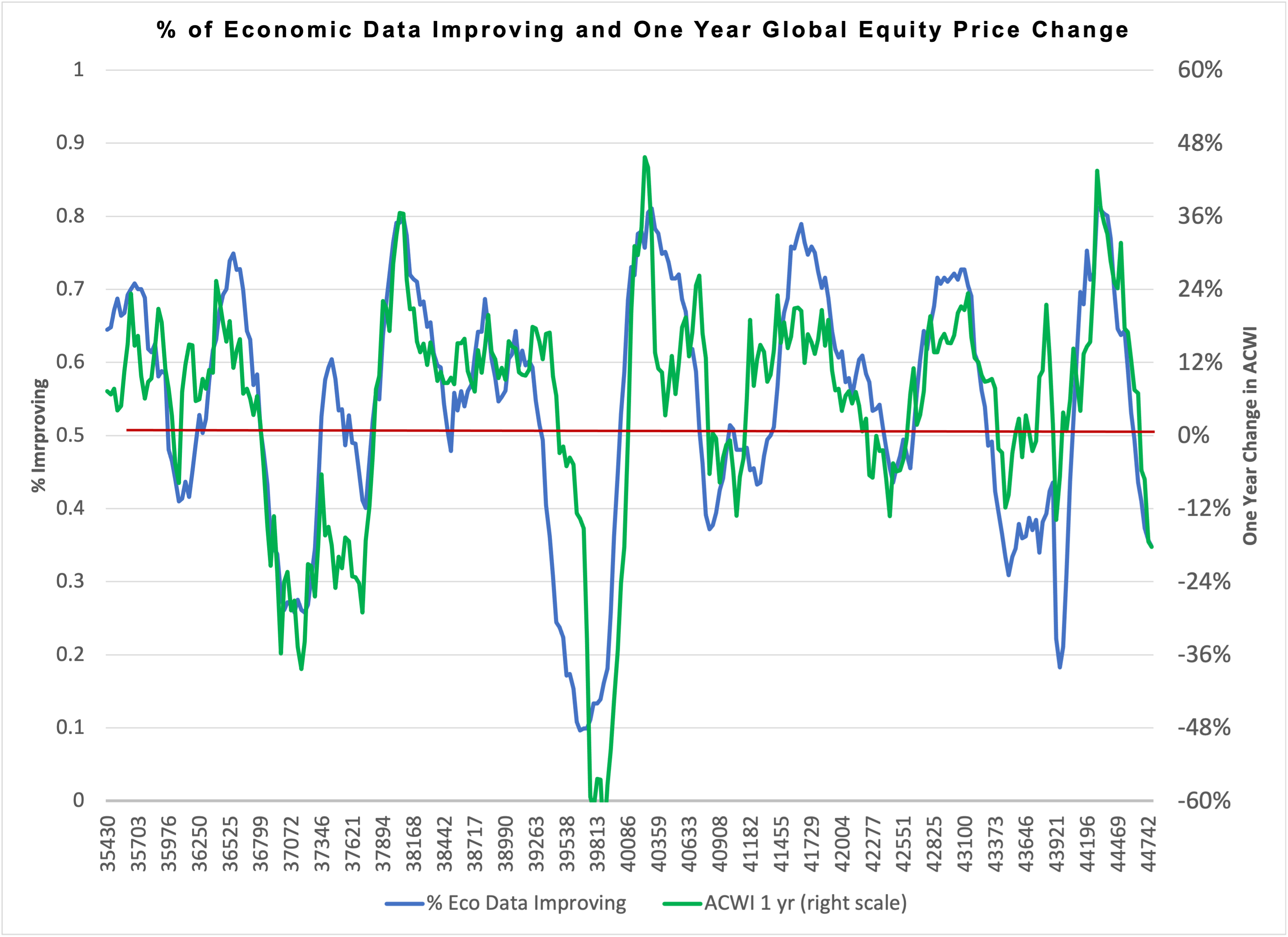
Changes in the economic data have the most important influence on changes in stock prices. Atlas Capital has a simple yet quite effective approach to determine how much stock prices ought to change given how much the economic data have changed, which is illustrated in the chart below. The blue line (left scale) is the percentage of a large database of economic indicators which improved in the prior year. The green line (right scale) is the prior year change in global equity prices (net of cash). Most of the time, the two lines track very closely as they should, but from time to time, there have been notable episodes of disconnect when market prices anticipated the future economic reality, as we witnessed in 2020 when the massive quantitative easing and fiscal stimulus happened during COVID. Stock market investors can fail to respond to the economic reality as well, as in 2007 to early 2008 when economic data deteriorated sharply well before stock market prices were impacted.
Currently, it appears that the equity market is tracking the economic data nearly perfectly; the loss in global equities (net of cash) we would expect in a twelve-month period where only 35% of the global economic indicators improved is precisely the amount lost from June 2021 to June 2022!
Equity investors need the economic data to start improving for there to be fundamental support for a sustained recovery in stock prices. Unfortunately, there is no sign of that yet – every month for the past year the percentage of economic data improving has gone down, as the mammoth COVID-related stimulus ends and monetary policy tightens to combat inflation.
Earnings Forecasts Are Still Too Optimistic
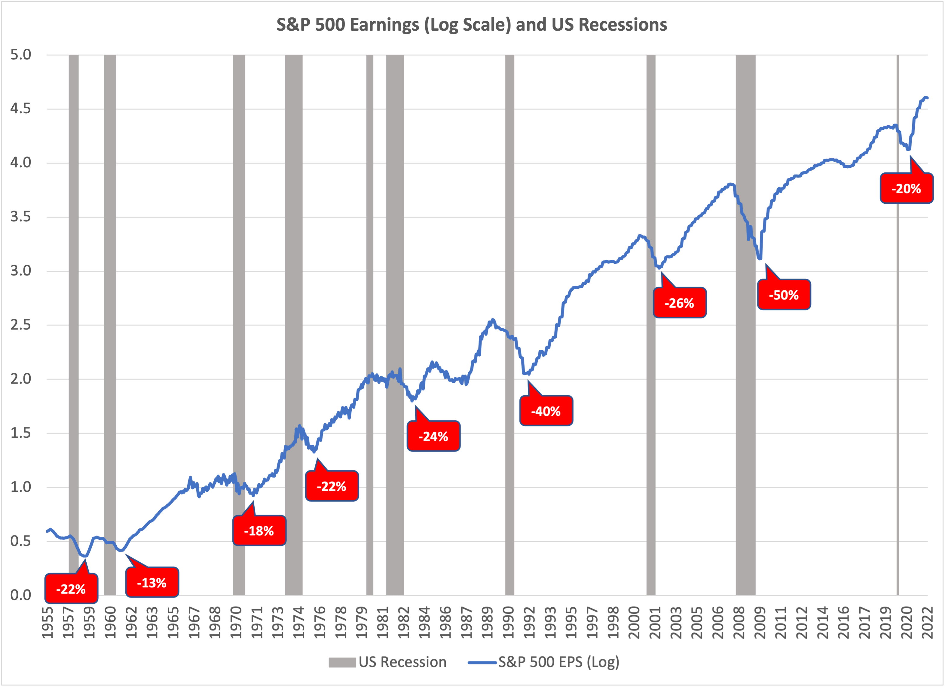
The decline in the earnings per share of US companies tends to be 20% or more during a recession, even if the recession is mild. Earnings peak before the recession begins and continue falling after the recession is over. The chart below shows the earnings per share of the S&P 500 since 1955 (log scale). The red markers show how much earnings fell from the pre-recession peak to the post-recession trough in each recession. Based on this history, if there is a recession, we should expect the EPS of the S&P 500 to fall by at least 20%. The current market expectation is that EPS for the S&P 500 in 2023 will be 30% higher relative to EPS in 2021. If a recession causes EPS to be 20% lower instead of 30% higher, the huge gap between forecast and actual earnings would be ample cause for another leg downward in stock prices.
How Will We Know the Bottom Has Been Reached?
In prior bear markets, the low price for global equities was reached around a point of maximum pessimism. Usually, at those times, the global economy was in recession and investors expected easing from central banks. We aren’t there yet. The low date for stock prices typically occurs within a few months of the low date for the economic information.
Stock market commentary today remains mostly optimistic and bullish. On June 15, the consensus Wall Street expectation for the S&P 500 index price in December 2022 was 4650[3], an extraordinary 25% rise from where it was on June 15, which would be the best 2nd half performance for the index since 1982. The Federal Reserve also believes the US economy remains strong – resilient enough to handle additional large increases in interest rates.
At Atlas Capital, we keep an eye on our equity downside risk dashboard[4]. The most important dashboard item is the first one, the global economic data trend. The economic data need to start getting better before we believe it will be safe for equity investors to increase their allocation to stocks.
Q3 2022 Client Equity Positioning
Atlas Capital’s systematic process for equity market selection seeks favorable value metrics and positive sentiment (price momentum). The Atlas website[5] provides an updated set of charts showing our value and momentum assessment for equity regions, sectors, and countries.
Regional selection
As the chart below illustrates, at the end of June the US was by far the least favorable region for equity investors, with the worst value and the worst momentum. In this chart (and on the website) the size of the bubble indicates the market weight of the equity region. The color of the bubble indicates whether we are over the benchmark weight (green), neutral (yellow), or under the benchmark (red).
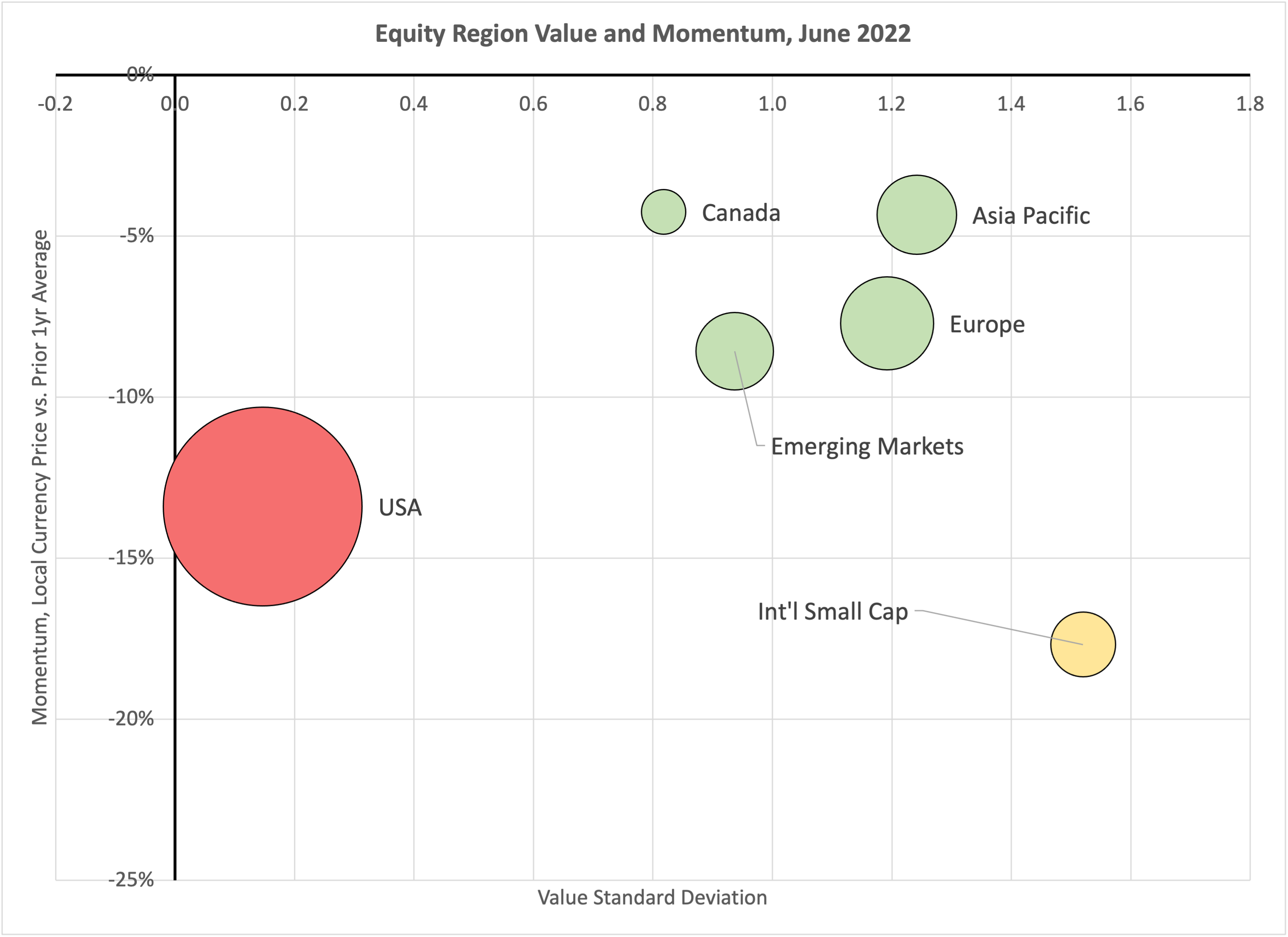
Our regional equity weights are tilted accordingly, as shown in the following chart. Clients are nearly 10% below the benchmark weight for the US, and above the benchmark in the three more favorable regions. Compared to our March 2022 positioning, we reduced the weight to the US, allocating more to Asia/Pacific and Emerging Markets.

chart
US Sector Selection
As mentioned, the US ranks at the bottom of our assessment of equity regions, and therefore we are underweight (red) nearly every sector. Two US choices have a neutral weight (yellow) and only energy is an overweight (green).
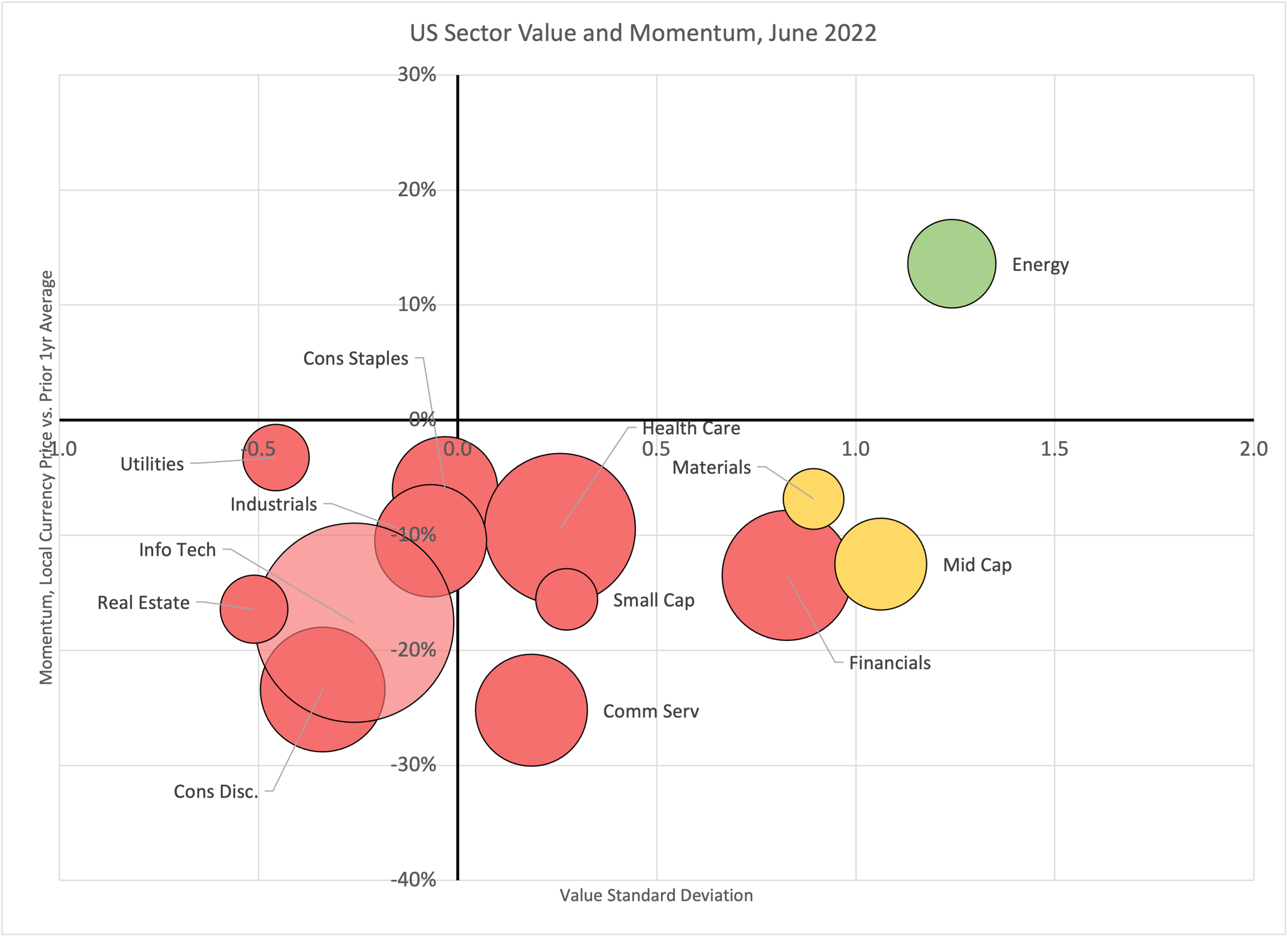
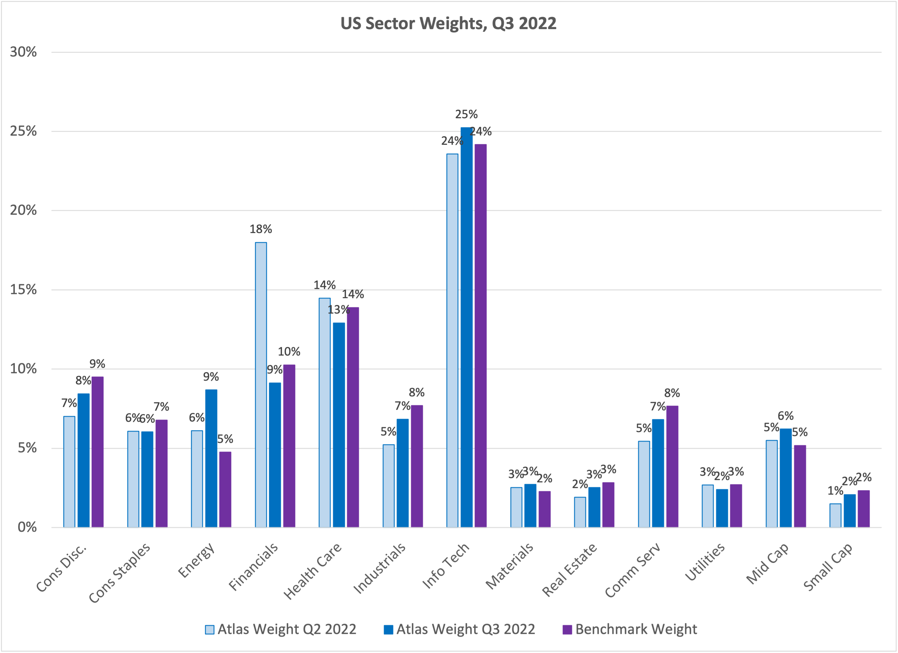
As compared to the March 2022 positioning, we made a large reduction in the weight given to financials. Increases were made in energy, industrials, consumer discretionary, and communication services.
Additional Client Investment Choices
In the June rebalance we became slightly more defensive in client equity portfolios, consistent with our cautious near-term outlook for equity prices. We removed a 1.8% position in MLPs, reallocating the assets to short-term TIPS. This brings most clients to about 10% below their normal equity weight, with the 10% being invested in short-term investment grade fixed income and short-term TIPS.
MLP prices began a sharp descent in June, as the boom in energy prices faltered and credit spreads soared. The price correction and the increasing odds of a recession led us to get out of MLPs for now.
Once the economic information (and equity prices) bottom out, we believe it will be helpful to add back to client equity allocations. It is likely that point will also be a good opportunity to invest back in MLPs and some of the other higher-risk asset classes which we took out of client portfolios this year to reduce losses in the downturn.
[1] Source: Bloomberg (SPX Index), National Bureau of Economic Research: https://www.nber.org/research/business-cycle-dating
[2] Source: Bloomberg, CONSSENT Index
[3] Source: Bloomberg
[4] https://atlasca.com/equity-downside-risk-dashboard/
[5] https://atlasca.com/current-market-assessment/#quantitativeassessment


This year through June was painful for equity investors. Global stocks were down nearly 19%, the worst first half of a year in over fifty years. Having gone down so much, is it time for equity prices to start recovering? Unfortunately, it looks like investors are likely to face more pain ahead before the bottom price of this cycle is reached. If a US recession is on the horizon (and that appears increasingly likely), then the odds are that the low of the stock market will occur while the recession is underway, not before.
The Stock Market Low Usually Happens During or After the Recession, Not Before
There have been twelve US recessions since World War II, the shaded periods in the chart above.[1] The blue line shows the S&P 500 index of US stocks (log scale). For eleven of these twelve recessions, the low point for the stock index occurred while the recession was underway. The exception to the rule is the 2001 recession – stocks continued to decline after the recession was over. There are no cases over this period where the stock market trough was reached before the recession occurred. But that’s exactly what investors hope for today!
A US Recession is Increasingly Likely
The metric which is most helpful for predicting US recessions is the proportion of global economic data which is “bad and getting worse”. A data series is “bad” if the current reading is below the median for the entire history of that metric. “Getting worse” means the latest data release is worse than the median for the prior year. As an example, the most recent University of Michigan Consumer Sentiment index reading is 50[2]. This index is currently in the “bad getting worse” category because 50 is lower than both the long-term median of 89.3 and the prior year average of 66.4. In fact, 50 is the worst reading in history!
In the last fifty years, whenever the proportion of data in the “bad getting worse” category rose over 50%, the US entered a recession, usually within a few months. Consequently, if we observe that this metric is climbing toward 50% (blue line rising toward the horizontal red line in the chart), particularly if several other items on our equity risk dashboard are negative, we will tend to lower the equity risk in client portfolios. As of June 2022, 45% of the economic indices we track are in the “bad getting worse” category. At the current pace of economic deterioration, the US would reach a recession before the end of 2022. Sometimes levels as high as 45% have been reached and the US economy turned for the better, without reaching a recession. But it’s hard to think of a likely source for a turnaround in the economic trend this year, particularly given that aggressive global monetary tightening is underway.
No More Disconnect! The Decline in Stock Prices Aligns with the Decline in Economic Indicators
Changes in the economic data have the most important influence on changes in stock prices. Atlas Capital has a simple yet quite effective approach to determine how much stock prices ought to change given how much the economic data have changed, which is illustrated in the chart below. The blue line (left scale) is the percentage of a large database of economic indicators which improved in the prior year. The green line (right scale) is the prior year change in global equity prices (net of cash). Most of the time, the two lines track very closely as they should, but from time to time, there have been notable episodes of disconnect when market prices anticipated the future economic reality, as we witnessed in 2020 when the massive quantitative easing and fiscal stimulus happened during COVID. Stock market investors can fail to respond to the economic reality as well, as in 2007 to early 2008 when economic data deteriorated sharply well before stock market prices were impacted.
Currently, it appears that the equity market is tracking the economic data nearly perfectly; the loss in global equities (net of cash) we would expect in a twelve-month period where only 35% of the global economic indicators improved is precisely the amount lost from June 2021 to June 2022!
Equity investors need the economic data to start improving for there to be fundamental support for a sustained recovery in stock prices. Unfortunately, there is no sign of that yet – every month for the past year the percentage of economic data improving has gone down, as the mammoth COVID-related stimulus ends and monetary policy tightens to combat inflation.
Earnings Forecasts Are Still Too Optimistic
The decline in the earnings per share of US companies tends to be 20% or more during a recession, even if the recession is mild. Earnings peak before the recession begins and continue falling after the recession is over. The chart below shows the earnings per share of the S&P 500 since 1955 (log scale). The red markers show how much earnings fell from the pre-recession peak to the post-recession trough in each recession. Based on this history, if there is a recession, we should expect the EPS of the S&P 500 to fall by at least 20%. The current market expectation is that EPS for the S&P 500 in 2023 will be 30% higher relative to EPS in 2021. If a recession causes EPS to be 20% lower instead of 30% higher, the huge gap between forecast and actual earnings would be ample cause for another leg downward in stock prices.
How Will We Know the Bottom Has Been Reached?
In prior bear markets, the low price for global equities was reached around a point of maximum pessimism. Usually, at those times, the global economy was in recession and investors expected easing from central banks. We aren’t there yet. The low date for stock prices typically occurs within a few months of the low date for the economic information.
Stock market commentary today remains mostly optimistic and bullish. On June 15, the consensus Wall Street expectation for the S&P 500 index price in December 2022 was 4650[3], an extraordinary 25% rise from where it was on June 15, which would be the best 2nd half performance for the index since 1982. The Federal Reserve also believes the US economy remains strong – resilient enough to handle additional large increases in interest rates.
At Atlas Capital, we keep an eye on our equity downside risk dashboard[4]. The most important dashboard item is the first one, the global economic data trend. The economic data need to start getting better before we believe it will be safe for equity investors to increase their allocation to stocks.
Q3 2022 Client Equity Positioning
Atlas Capital’s systematic process for equity market selection seeks favorable value metrics and positive sentiment (price momentum). The Atlas website[5] provides an updated set of charts showing our value and momentum assessment for equity regions, sectors, and countries.
Regional selection
As the chart below illustrates, at the end of June the US was by far the least favorable region for equity investors, with the worst value and the worst momentum. In this chart (and on the website) the size of the bubble indicates the market weight of the equity region. The color of the bubble indicates whether we are over the benchmark weight (green), neutral (yellow), or under the benchmark (red).
Our regional equity weights are tilted accordingly, as shown in the following chart. Clients are nearly 10% below the benchmark weight for the US, and above the benchmark in the three more favorable regions. Compared to our March 2022 positioning, we reduced the weight to the US, allocating more to Asia/Pacific and Emerging Markets.
chart
US Sector Selection
As mentioned, the US ranks at the bottom of our assessment of equity regions, and therefore we are underweight (red) nearly every sector. Two US choices have a neutral weight (yellow) and only energy is an overweight (green).
As compared to the March 2022 positioning, we made a large reduction in the weight given to financials. Increases were made in energy, industrials, consumer discretionary, and communication services.
Additional Client Investment Choices
In the June rebalance we became slightly more defensive in client equity portfolios, consistent with our cautious near-term outlook for equity prices. We removed a 1.8% position in MLPs, reallocating the assets to short-term TIPS. This brings most clients to about 10% below their normal equity weight, with the 10% being invested in short-term investment grade fixed income and short-term TIPS.
MLP prices began a sharp descent in June, as the boom in energy prices faltered and credit spreads soared. The price correction and the increasing odds of a recession led us to get out of MLPs for now.
Once the economic information (and equity prices) bottom out, we believe it will be helpful to add back to client equity allocations. It is likely that point will also be a good opportunity to invest back in MLPs and some of the other higher-risk asset classes which we took out of client portfolios this year to reduce losses in the downturn.
[1] Source: Bloomberg (SPX Index), National Bureau of Economic Research: https://www.nber.org/research/business-cycle-dating
[2] Source: Bloomberg, CONSSENT Index
[3] Source: Bloomberg
[4] https://atlasca.com/equity-downside-risk-dashboard/
[5] https://atlasca.com/current-market-assessment/#quantitativeassessment
Subscribe To Receive The Latest News
Related Posts
March 2024 Recap
Europe or the Big Six?
Have Alternative Investments Helped Investment Outcomes?
February 2024 Recap