


Academic research finds a recurring pattern in financial crises. Investors and borrowers tend to extrapolate, expecting the conditions of the recent past to continue. These dynamics lead to self-reinforcing uptrends in credit, investment markets, and the economy, causing the Value (likely return relative to risk) of investment assets to deteriorate.
Market busts and financial crises arise when optimistic beliefs are disappointed. The usual source of disappointment is a downturn in economic growth. The headline description for most of the equity bear markets in US history is: “Stocks were expensive, and then there was a recession.”
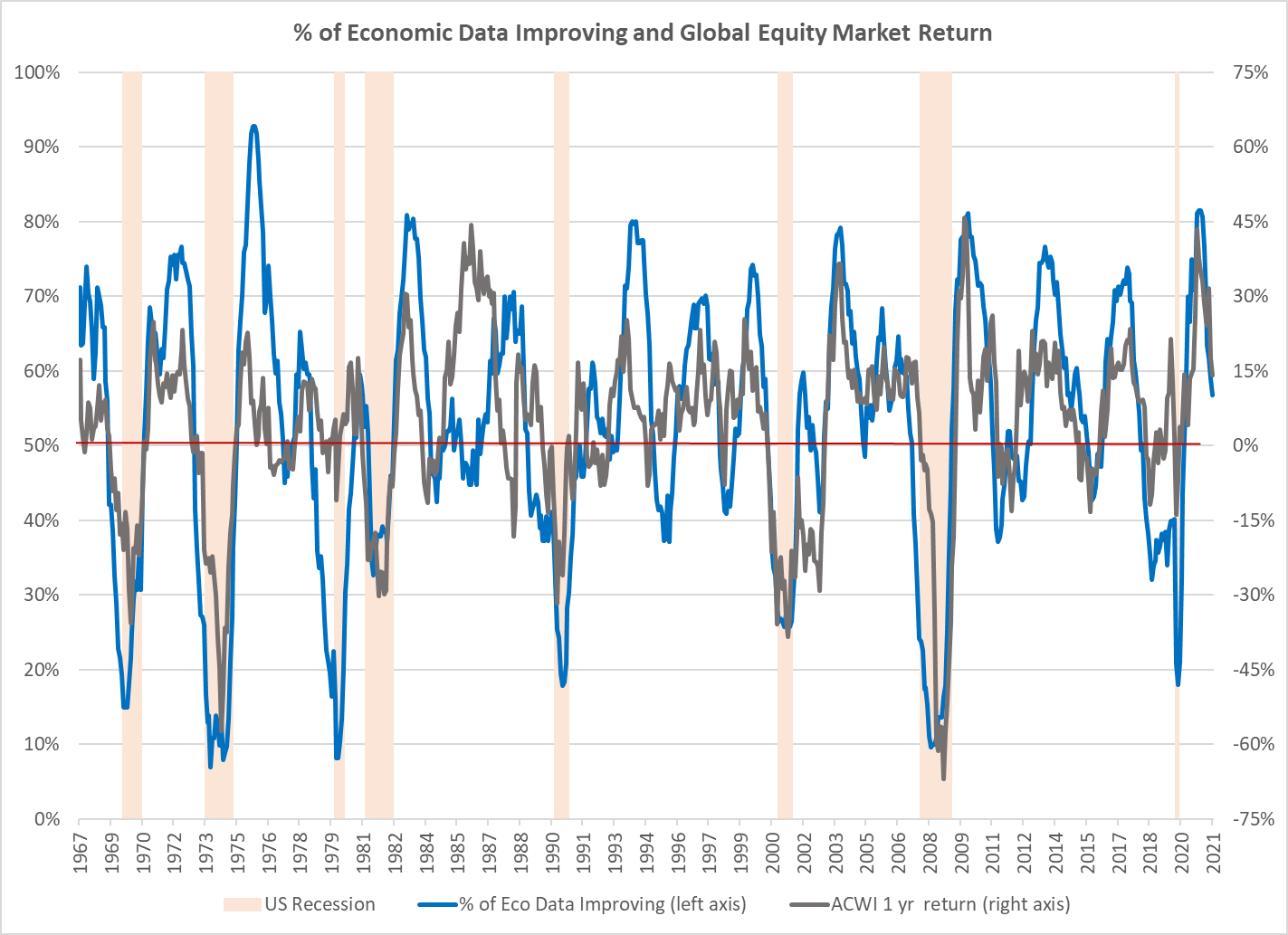
Economic growth drives earnings growth, and earnings growth drives stock prices. As a consequence, changes in the economy and in stock prices are closely aligned. To track changes in the global economy, Atlas tracks the most important economic data from the fourteen countries with the largest GDP. We use the data to create a big-picture view of economic changes. The two lines on the chart below are the one-year change in global stock prices (in green) and the percentage of the economic data which improved in the prior year. It’s quite evident from the chart that equity price changes are tightly interlinked with economic changes.
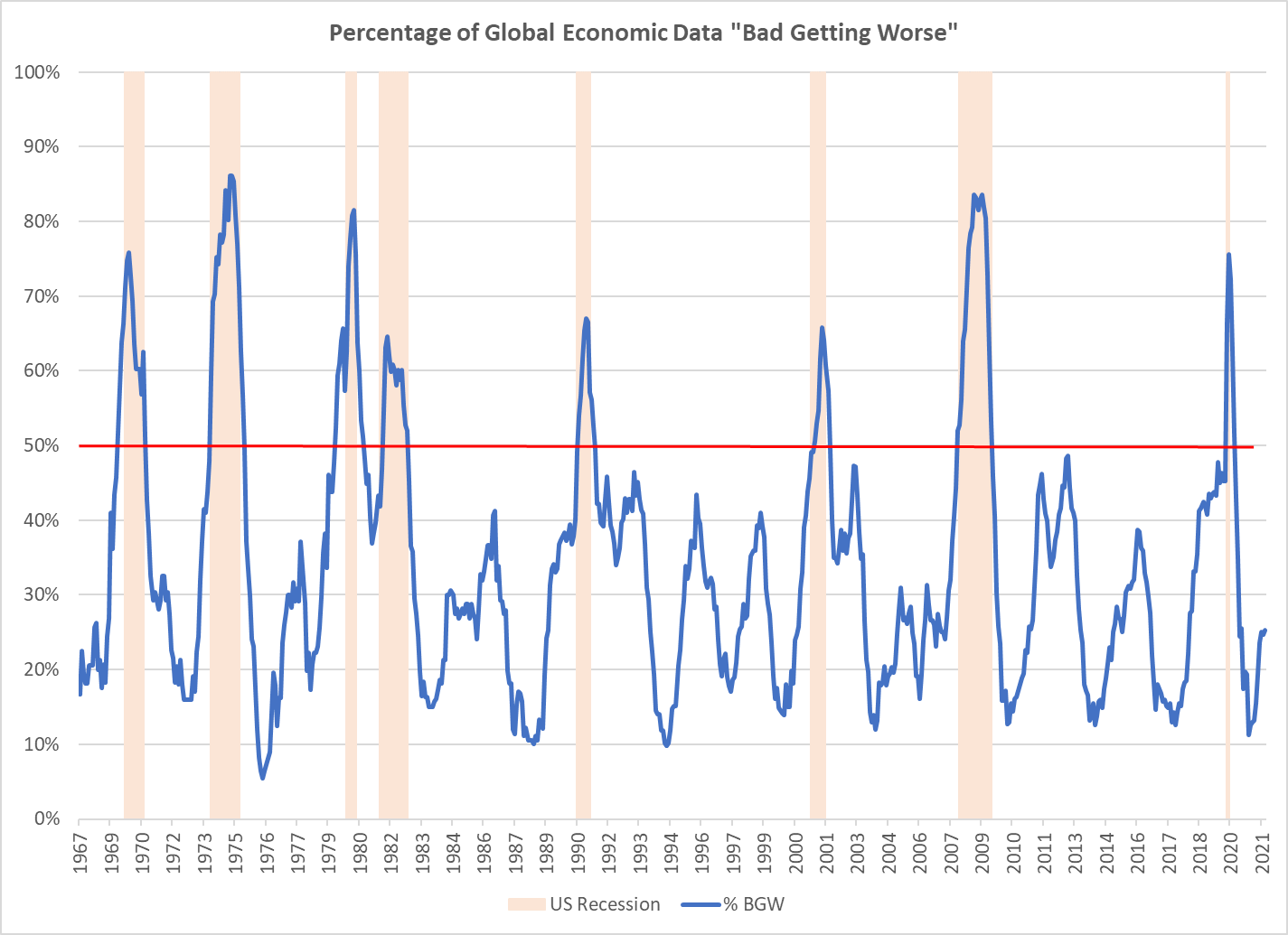
Investors in equities are most vulnerable to sustained losses when stocks are expensive, and there is a recession. It is straightforward to observe expensiveness, but unfortunately, it is quite challenging to predict if a recession might happen in the next year. The metric which Atlas has found would have been most helpful for predicting US recessions is the proportion of global economic data, which is “bad and getting worse”. “Bad” means the data is below the median for the entire history of that data series. “Getting worse” means the latest data release is worse than the median for the prior year. In the last fifty years, whenever the proportion of data in the “bad getting worse” category rose over 50%, the US entered a recession, usually within a few months. Consequently, if Atlas observes that this metric is climbing toward 50%, particularly if several other items on our equity risk dashboard are negative, we will tend to advise clients to lower the equity risk in their portfolios.