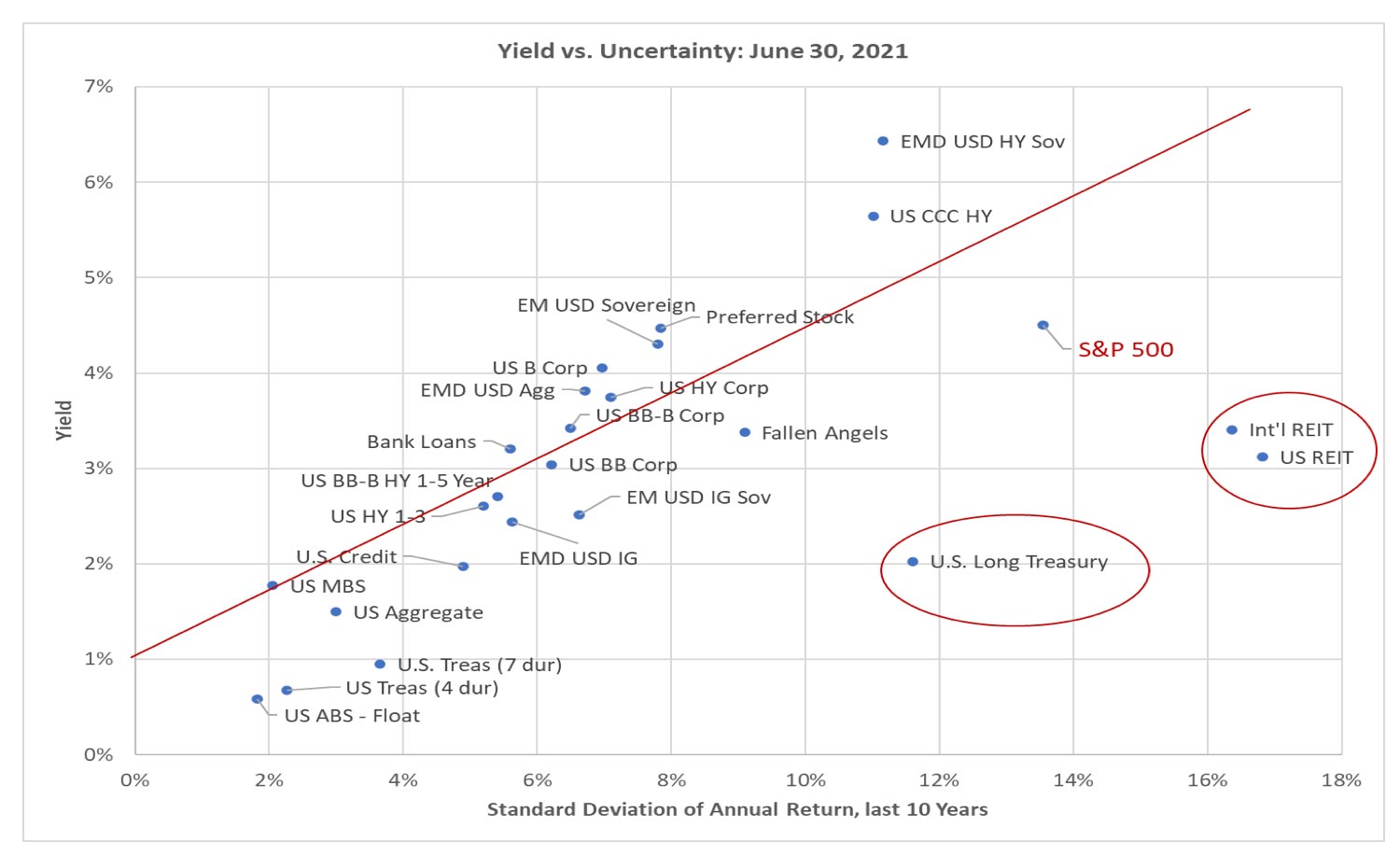
Investors face a trade-off between expected return and the uncertainty of achieving that return. A simple but sometimes useful way to illustrate the available choices is to plot yield against risk, as shown in the chart above. The vertical axis on the chart is the investment current yield/expected return. The horizontal axis is the uncertainty of the return, measured as the standard deviation of the annual return over the past ten years. Standard deviation is a statistical measure of risk. For instance, a standard deviation of 5% means there is a 65% chance that in the next year the return will be within +/- 5% of the return we expect. The red line on the chart indicates a ratio of 0.35 between the extra yield over Treasury Bills (assumed to be 1% on average) and standard deviation. That ratio is typically referred to as the “deal breakeven”, across most categories of investment assets. Above the line is a “deal” for investors.
This chart above is often called the Capital Market Line and is the starting point of further analysis for investment professionals. We look at the slope of the line, as well as cross-asset relationships both historically and at any given time. The Capital Market Line today is decidedly lower (less yield for a given level of risk) than what historically we have seen. Within this menu of very poor choices, long-term US Treasuries and REITs (shown in red circles) stand out – in a bad way!
Many market commentators have discussed just how unattractive investing in long-term (30-year) US Treasury bonds is today. The 2% yield is guaranteed, but the risk and expected volatility for the long bond is almost as high as investing in the S&P 500. A small rise in the yield on 30-year treasury bonds from 2% to 3% would cause investors in those bonds to lose more than 20% of their investment, giving this asset class an unappealing relationship between low expected return and the amount which could be quickly lost.
We have the US Federal Reserve to thank for causing long term Treasury bonds to become a bad investment. In the past 15 months, the US Fed has purchased more than $4 trillion in US Treasury, Agency and Mortgage-Backed Securities, causing yields to be lower than they would otherwise be. Additionally, Quantitative Easing (QE) measures have artificially reduced volatility in some of these asset classes.
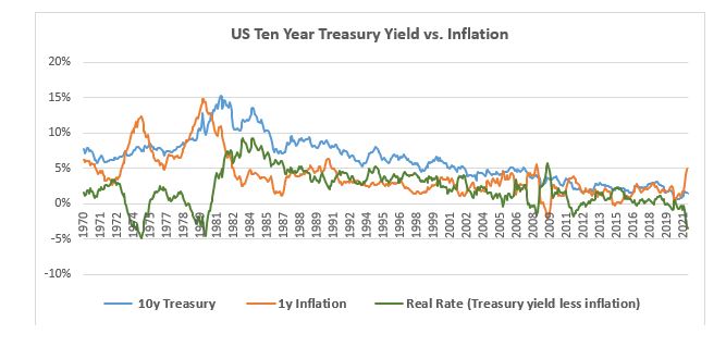
Another anomaly that has arrived because of Fed intervention is the disconnect between US Treasury yields and inflation. For the past 100 years, the yield on the US 10-year Treasury note has averaged about 2% higher than US consumer price inflation (CPI). The present yield of 1.35% is over 4% lower than the most recent 5.4% June 2021 reading for year-over-year CPI. The 5.4% release was elevated by comparison to the slumping economy of June 2020 (hence the transitory inflation debate). Nonetheless, even if CPI settles down to the 3% range, US Treasuries offer low odds of a positive return relative to inflation. The relationship of Treasury yields to inflation (green line in chart) is now the worst since 1980. Historically, whenever Treasury yields were below inflation, investors frequently had negative real returns (returns less than inflation) for the subsequent one, three and five years.[1]
[1] Source: Robert Shiller dataset: http://www.econ.yale.edu/~shiller/data.htm, Atlas Capital analysis
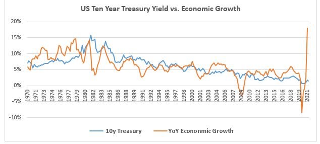
There is also a disconnect between US Treasury yields and economic growth. This disconnect is harder to rationalize away with the simplistic “transitory inflation” narrative. In the past 50 years, the nominal US economy has grown at an annual rate of 6.2%. During the same period, average 10-year Treasury yields have been nearly identical, at 6.1%. The chart on the next page indicates this historical relationship between economic growth and 10-year yields. The US economy is booming now, with nominal growth of 10% predicted for 2021. In a few years, nominal growth is expected to settle down to about 5% per year, but even then, a 1.35% yield on 10-year Treasuries would be very low relative to the level of economic growth.
We argue that the Fed’s QE actions have also adversely affected REIT valuations.
There has been quite a lot of chatter about inflation pressure as the economy re-opens, and it is no surprise that many investors are beginning to pay attention to “real” assets – gold, real estate, commodities – which are expected to keep up if inflation rises. Of the real assets, real estate assets have the largest position in most investor portfolios, becoming a favored way to guard against inflation risk.
But REITs are the other category on our chart which currently look like a poor investment choice. By law, REITs most pay out at least 90% of their earnings as dividends. The amount paid out in dividends does not tend to grow. The current amount of dividends paid per share for the FTSE NAREIT All Equity REITs index is about the same as it was 20 years ago. With no dividend growth, an investor in the REIT index should expect a future return equal to the dividend yield when they invest, plus or minus any capital gains or losses generated by changes in the dividend yield.
In many respects, REIT return sensitivities are similar to those of US Treasury 30-year bonds. Like bonds, REIT returns are very sensitive to changes in yield. If the dividend yield rose from 3% to 4%, investors in REITs would lose more than 20% of their investment. Look back to March 2020 when pandemic induced selling caused REIT yields to rise from 3.8% to 4.8%; prices fell about 20%. Because of this sensitivity, REITs are a volatile asset class, with more historical volatility than the S&P 500 stock index. Investors in REITs have enjoyed the benefit of a steady decline in dividend yields over the years. But the current yield of 3% is the lowest in history.
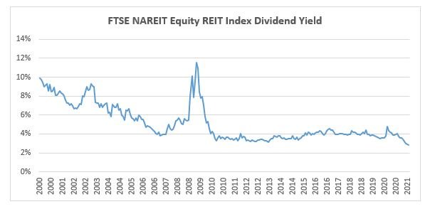
The base case for investors in REITs today would be to earn the current 3% dividend yield going forward. It would be possible for investors to earn more than 3% if dividend yields fall further to new record lows. The danger faced by REIT investors is higher dividend yields. The 3% yield is not very high relative to the amount which might be lost quickly. If or when the US Federal Reserve pulls back on market intervention and allows markets to set prices, the tendency should be for interest rates to rise. We believe there are better, less risky, ways than REITs to target a 3% (or less) return; it’s why we removed REITs from client portfolios at the end of June.
In the June 2021 rebalance, we maintained client positions in preferred stocks. The historical return on preferreds has tended to be a bit lower than the starting yield. But even if future returns are 1% lower than the current yield, we remain near the red line on our chart, with a better relationship of return to risk relative to other choices. Preferreds look like a way to obtain close to the annual return of the stock market with less uncertainty in return.
We should note, however, that preferred stocks can sell off significantly. Most of the securities in the preferred index are issued by banks. In the Global Financial Crisis of 2008-2009, investors in preferred stock had mark-to-market losses of more than 50%. Fears for the stability of the banking system were a prominent feature in that crisis. The banking system was supported, and investors in preferred stocks who held on quickly recovered their losses. At this point, US banks have stronger balance sheets than they had going into the GFC, and the Dodd-Frank legislation has curbed risk-taking by banks, which suggests that preferred stock investments are on a sounder footing than was the case in 2007.
A quick word on the US stock market. On average, the earnings per share of the S&P 500 have grown at about the same rate as the US economy. On average, the price to earnings (P/E) ratio has been below 20. If we assume that earnings grow with the economy over the next ten years (using consensus economic forecasts), and that the P/E ratio ten years from now is 20 (down from a record high 31 today), then the annual return for the S&P 500 would be 4.5%. That is why we used a 4.5% yield for the S&P 500 on the chart. The forward earnings yield (next 12 months EPS projection divided by current index price) is also about 4.5%. If we use the 4.5% yield for the S&P, the relationship of yield to risk is better than Treasury bonds or REITs, but also appears worse than some of the other possibilities on the investment menu.
In summary, a simple plot of yield versus risk can sometimes identify outliers. As of June 30, 2021, everything is expensive. But long-term US Treasury bonds and REITs offer a particularly unfavorable combination of low expected return and high uncertainty of return.


Investors face a trade-off between expected return and the uncertainty of achieving that return. A simple but sometimes useful way to illustrate the available choices is to plot yield against risk, as shown in the chart above. The vertical axis on the chart is the investment current yield/expected return. The horizontal axis is the uncertainty of the return, measured as the standard deviation of the annual return over the past ten years. Standard deviation is a statistical measure of risk. For instance, a standard deviation of 5% means there is a 65% chance that in the next year the return will be within +/- 5% of the return we expect. The red line on the chart indicates a ratio of 0.35 between the extra yield over Treasury Bills (assumed to be 1% on average) and standard deviation. That ratio is typically referred to as the “deal breakeven”, across most categories of investment assets. Above the line is a “deal” for investors.
This chart above is often called the Capital Market Line and is the starting point of further analysis for investment professionals. We look at the slope of the line, as well as cross-asset relationships both historically and at any given time. The Capital Market Line today is decidedly lower (less yield for a given level of risk) than what historically we have seen. Within this menu of very poor choices, long-term US Treasuries and REITs (shown in red circles) stand out – in a bad way!
Many market commentators have discussed just how unattractive investing in long-term (30-year) US Treasury bonds is today. The 2% yield is guaranteed, but the risk and expected volatility for the long bond is almost as high as investing in the S&P 500. A small rise in the yield on 30-year treasury bonds from 2% to 3% would cause investors in those bonds to lose more than 20% of their investment, giving this asset class an unappealing relationship between low expected return and the amount which could be quickly lost.
We have the US Federal Reserve to thank for causing long term Treasury bonds to become a bad investment. In the past 15 months, the US Fed has purchased more than $4 trillion in US Treasury, Agency and Mortgage-Backed Securities, causing yields to be lower than they would otherwise be. Additionally, Quantitative Easing (QE) measures have artificially reduced volatility in some of these asset classes.
Another anomaly that has arrived because of Fed intervention is the disconnect between US Treasury yields and inflation. For the past 100 years, the yield on the US 10-year Treasury note has averaged about 2% higher than US consumer price inflation (CPI). The present yield of 1.35% is over 4% lower than the most recent 5.4% June 2021 reading for year-over-year CPI. The 5.4% release was elevated by comparison to the slumping economy of June 2020 (hence the transitory inflation debate). Nonetheless, even if CPI settles down to the 3% range, US Treasuries offer low odds of a positive return relative to inflation. The relationship of Treasury yields to inflation (green line in chart) is now the worst since 1980. Historically, whenever Treasury yields were below inflation, investors frequently had negative real returns (returns less than inflation) for the subsequent one, three and five years.[1]
[1] Source: Robert Shiller dataset: http://www.econ.yale.edu/~shiller/data.htm, Atlas Capital analysis
There is also a disconnect between US Treasury yields and economic growth. This disconnect is harder to rationalize away with the simplistic “transitory inflation” narrative. In the past 50 years, the nominal US economy has grown at an annual rate of 6.2%. During the same period, average 10-year Treasury yields have been nearly identical, at 6.1%. The chart on the next page indicates this historical relationship between economic growth and 10-year yields. The US economy is booming now, with nominal growth of 10% predicted for 2021. In a few years, nominal growth is expected to settle down to about 5% per year, but even then, a 1.35% yield on 10-year Treasuries would be very low relative to the level of economic growth.
We argue that the Fed’s QE actions have also adversely affected REIT valuations.
There has been quite a lot of chatter about inflation pressure as the economy re-opens, and it is no surprise that many investors are beginning to pay attention to “real” assets – gold, real estate, commodities – which are expected to keep up if inflation rises. Of the real assets, real estate assets have the largest position in most investor portfolios, becoming a favored way to guard against inflation risk.
But REITs are the other category on our chart which currently look like a poor investment choice. By law, REITs most pay out at least 90% of their earnings as dividends. The amount paid out in dividends does not tend to grow. The current amount of dividends paid per share for the FTSE NAREIT All Equity REITs index is about the same as it was 20 years ago. With no dividend growth, an investor in the REIT index should expect a future return equal to the dividend yield when they invest, plus or minus any capital gains or losses generated by changes in the dividend yield.
In many respects, REIT return sensitivities are similar to those of US Treasury 30-year bonds. Like bonds, REIT returns are very sensitive to changes in yield. If the dividend yield rose from 3% to 4%, investors in REITs would lose more than 20% of their investment. Look back to March 2020 when pandemic induced selling caused REIT yields to rise from 3.8% to 4.8%; prices fell about 20%. Because of this sensitivity, REITs are a volatile asset class, with more historical volatility than the S&P 500 stock index. Investors in REITs have enjoyed the benefit of a steady decline in dividend yields over the years. But the current yield of 3% is the lowest in history.
The base case for investors in REITs today would be to earn the current 3% dividend yield going forward. It would be possible for investors to earn more than 3% if dividend yields fall further to new record lows. The danger faced by REIT investors is higher dividend yields. The 3% yield is not very high relative to the amount which might be lost quickly. If or when the US Federal Reserve pulls back on market intervention and allows markets to set prices, the tendency should be for interest rates to rise. We believe there are better, less risky, ways than REITs to target a 3% (or less) return; it’s why we removed REITs from client portfolios at the end of June.
In the June 2021 rebalance, we maintained client positions in preferred stocks. The historical return on preferreds has tended to be a bit lower than the starting yield. But even if future returns are 1% lower than the current yield, we remain near the red line on our chart, with a better relationship of return to risk relative to other choices. Preferreds look like a way to obtain close to the annual return of the stock market with less uncertainty in return.
We should note, however, that preferred stocks can sell off significantly. Most of the securities in the preferred index are issued by banks. In the Global Financial Crisis of 2008-2009, investors in preferred stock had mark-to-market losses of more than 50%. Fears for the stability of the banking system were a prominent feature in that crisis. The banking system was supported, and investors in preferred stocks who held on quickly recovered their losses. At this point, US banks have stronger balance sheets than they had going into the GFC, and the Dodd-Frank legislation has curbed risk-taking by banks, which suggests that preferred stock investments are on a sounder footing than was the case in 2007.
A quick word on the US stock market. On average, the earnings per share of the S&P 500 have grown at about the same rate as the US economy. On average, the price to earnings (P/E) ratio has been below 20. If we assume that earnings grow with the economy over the next ten years (using consensus economic forecasts), and that the P/E ratio ten years from now is 20 (down from a record high 31 today), then the annual return for the S&P 500 would be 4.5%. That is why we used a 4.5% yield for the S&P 500 on the chart. The forward earnings yield (next 12 months EPS projection divided by current index price) is also about 4.5%. If we use the 4.5% yield for the S&P, the relationship of yield to risk is better than Treasury bonds or REITs, but also appears worse than some of the other possibilities on the investment menu.
In summary, a simple plot of yield versus risk can sometimes identify outliers. As of June 30, 2021, everything is expensive. But long-term US Treasury bonds and REITs offer a particularly unfavorable combination of low expected return and high uncertainty of return.
Subscribe To Receive The Latest News
Related Posts
March 2024 Recap
Europe or the Big Six?
Have Alternative Investments Helped Investment Outcomes?
February 2024 Recap